Visual Prompting
What separates a prompt that returns generic stock art from one that returns exactly what you pictured?
Structure. The same structure that separates a wishlist from a blueprint.
The Problem
Most visual prompts fail the same way: too vague on layout, too specific on adjectives. "A beautiful futuristic dashboard with glowing elements" returns something. It never returns what you needed.
| Prompt Failure | What Happens | Root Cause |
|---|---|---|
| No spatial layout | AI guesses composition | You described WHAT, not WHERE |
| No colour constraints | Random palette | You left the biggest visual decision to chance |
| Style + content mixed | Incoherent output | Two different instructions fighting |
| No negative prompts | Unwanted elements appear | You only said what you want, not what you don't |
| Text in the image | Garbled letterforms | Current models can't reliably render text |
The Template
Fill in each section. Skip nothing. Order matters.
[1. FORMAT]
Aspect ratio, orientation, resolution intent.

[2. WHAT — Subject and composition]
The thing itself. Spatial layout. What goes where.

[3. STYLE — Visual language]
Aesthetic reference. Art direction. Period, medium, influence.

[4. COLOUR — Palette]
Specific hex codes or named palette. Background, foreground, accent.

[5. TYPOGRAPHY — Text handling]
What text MUST appear. What text to add in post-production instead.

[6. MOOD — Feeling]
What emotion does the viewer experience? One sentence.

[7. NOT — Negative prompts]
What to exclude. Be specific about common failure modes.

[8. PARAMS — Model-specific flags]
Midjourney: --ar, --style, --s, --v
Stable Diffusion: negative prompt, CFG scale, steps
DALL-E: style parameter
Section by Section
1. Format
State this first. It constrains everything.
| Format | When to Use |
|---|---|
16:9 landscape | Presentations, hero images, diagrams |
9:16 portrait | Mobile, social stories |
1:1 square | Social posts, avatars |
4:5 portrait | Instagram feed |
21:9 ultrawide | Cinematic, banners |
2. Subject
Describe composition like a stage direction, not a wish. Name the spatial zones.
| Weak | Strong |
|---|---|
| "A diagram showing business concepts" | "Three-column triptych. Left column: five stacked horizontal bars. Centre: ten nodes in a clockwise ring with directional arrows. Right: single block with text above." |
| "Some shapes connected together" | "Rounded rectangles with thin 1px borders arranged in a circle, connected by directional arrows forming continuous clockwise flow." |
Use concrete spatial language: top-left, centre, bottom third, foreground, background. Name how many elements exist. State their relationships.
3. Style
Reference real things. "Clean" means nothing to a model. "Edward Tufte's information density meets Dieter Rams' minimalism" means everything.
| Reference Type | Example |
|---|---|
| Designer/artist | "Massimo Vignelli's grid discipline" |
| Medium | "Screen-printed poster, limited colour run" |
| Era | "Swiss International Style, 1960s" |
| Product | "Bloomberg terminal aesthetic" |
| Combination | "Apple keynote data visualisation meets transit map clarity" |
4. Colour
Never leave colour to chance. Three minimum: background, primary, accent.
Background: #111827 (near-black blue-gray)
Text/primary: #F9FAFB (warm white)
Accent: #7C3AED (purple — used sparingly, POSITION blocks only)
Secondary accent: #B91C1C (crimson — feedback chain)
Muted: #D1D5DB (gray — labels, secondary text)
Name where each colour appears. "Purple for accent" is vague. "Purple #7C3AED for the two POSITION blocks only" gives the model a constraint it can follow.
5. Typography
Current AI cannot reliably render text. Plan for this.
| Strategy | When |
|---|---|
| No text in image | Safest. Add all text in Figma/Canva after. |
| Minimal text | 1-3 short labels. Works in Ideogram, unreliable in Midjourney. |
| Text-heavy | Generate layout only. Overlay all text in post. |
If you need text, state it explicitly: Label reads exactly: "PROTOCOLS". Still expect to fix it manually.
6. Mood
One sentence. Not a list of adjectives — a feeling the viewer should have.
| Weak | Strong |
|---|---|
| "Professional, modern, clean, sleek" | "The clarity of a well-designed transit map." |
| "Inspiring and motivational" | "Forward momentum. A control room coming online." |
7. Negative Prompts
Tell the model what to exclude. Be specific about the failure modes of your category.
For information design:
NOT: clipart, generic corporate, motivational poster, 3D renders,
gradients everywhere, drop shadows, glossy effects, stock photo elements,
decorative borders, watercolor, hand-drawn sketch, people, faces.
For product photography:
NOT: floating objects, impossible reflections, extra fingers,
blurred text, watermarks, collage layouts.
Match your negatives to the category. Different subjects have different failure modes.
8. Model Parameters
Each tool has specific flags that matter.
| Tool | Key Parameters |
|---|---|
| Midjourney | --ar 16:9 aspect ratio, --style raw less artistic interpretation, --s 50 low stylisation, --v 7 model version |
| DALL-E | style: natural or style: vivid, size specification |
| Flux/SD | CFG scale (7-12 typical), steps (20-50), negative prompt field |
| Ideogram | Aspect ratio, magic prompt on/off (off for precise control) |
--style raw in Midjourney is critical for diagrams and information design. Without it, the model adds artistic embellishment that fights your layout.
Video Prompting
Motion adds three dimensions: sequence (what appears when), duration (how long each beat holds), easing (how elements move).
The Video Template
[1. FORMAT]
Duration, resolution, aspect ratio.

[2. SEQUENCE — Beat sheet]
Second-by-second breakdown. What appears, what moves, what holds.

[3. STYLE — Motion language]
Animation style. Reference real motion design.

[4. COLOUR + TYPOGRAPHY]
Same as static. Plus: do elements change colour over time?

[5. TRANSITIONS]
How does beat 1 become beat 2? Fade, scale, draw-on, cut?

[6. HOLD FRAME]
What does the final frame look like? How long does it hold?

[7. NOT — Motion negatives]
What motion behaviours to avoid.
Sequence Discipline
The biggest video prompt failure: describing the final state without describing how you get there.
| Weak | Strong |
|---|---|
| "Show a diagram building up" | "0-3s: Two purple blocks fade in simultaneously at left and right edges. A dashed line draws between them left-to-right. Label 'THE GAP' appears at midpoint." |
| "Animate the nodes appearing" | "3-7s: Ten nodes emerge one-by-one clockwise, each scaling from 0 to full size over 0.3s. Once all placed, directional arrows draw between them over 1s." |
State seconds. State direction. State what triggers the next beat.
Motion Negatives
NOT: 3D camera moves, particle effects, lens flares, zoom transitions,
bouncy/playful animation, corporate template motion graphics,
swooshes, light leaks, stock footage.
Current video AI (Runway Gen-3, Kling, Sora) handles 5-10 second clips well. For longer sequences, generate clips per beat and composite.
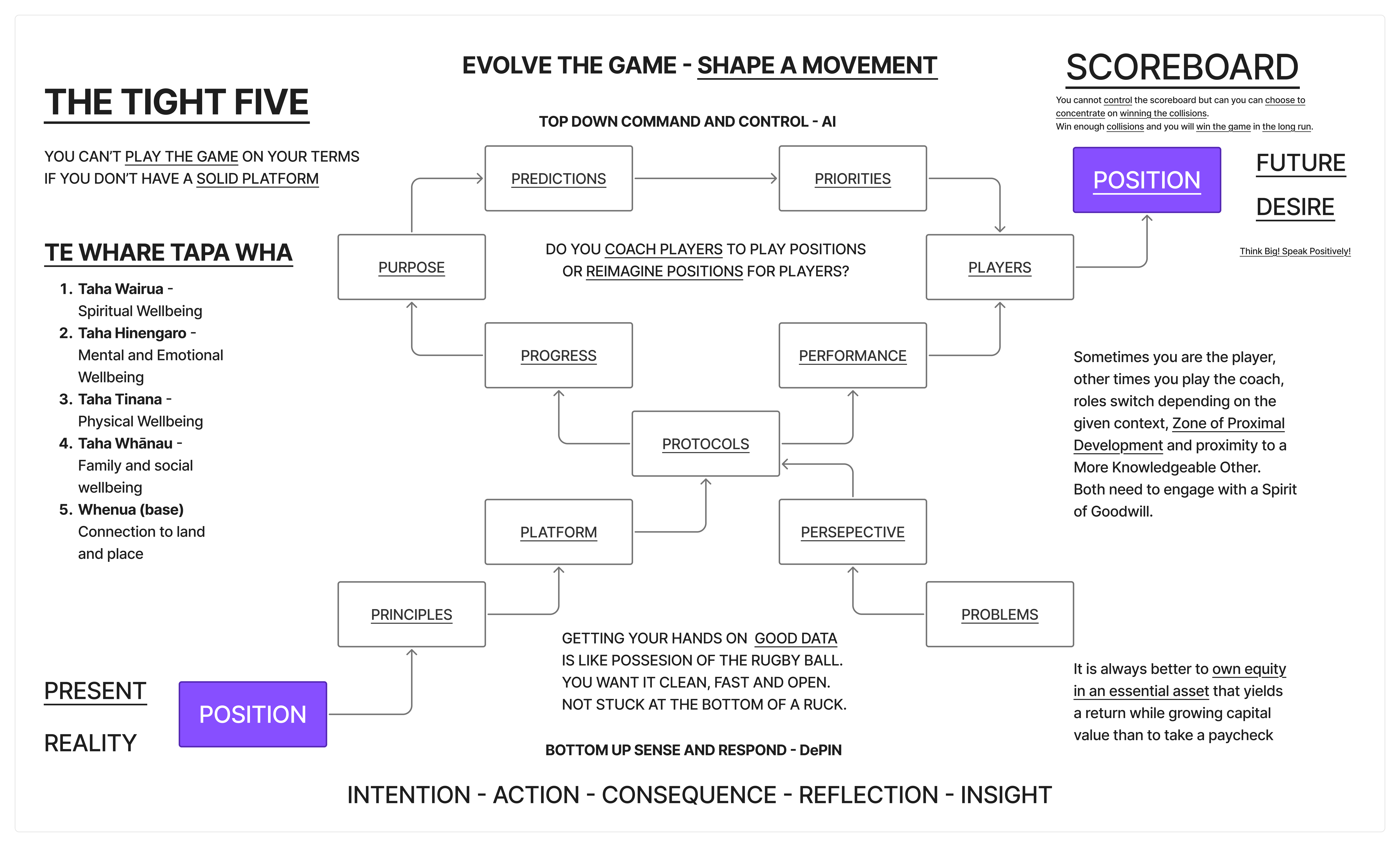
Worked Example
The Tight Five diagram as a complete prompt. This information design poster shows a rugby-strategy-to-business mapping with three zones, ten cycling nodes, and a feedback spine.
Static Version
A premium information design poster visualizing "The Tight Five"
strategic framework, landscape 16:9. Dark charcoal background
(#111827), clean modern aesthetic — Edward Tufte information density
meets Dieter Rams clarity.

THREE-COLUMN TRIPTYCH:

LEFT — "PRESENT REALITY". Purple (#7C3AED) block labeled "POSITION"
at bottom. Above it, five stacked horizontal bars in earthy tones
(amber, ochre, sage, teal, slate) labeled: Wairua, Hinengaro,
Tinana, Whanau, Whenua. Label: "TE WHARE TAPA WHA".

CENTRE (50% width) — Ten rounded-rectangle nodes in a clockwise ring
connected by thin directional arrows. Nodes: PREDICTIONS, PRIORITIES,
PLAYERS, PERFORMANCE, PERSPECTIVE, PLATFORM, PRINCIPLES, PURPOSE,
PROGRESS, PROTOCOLS. Centre italic text: "Do you coach players to
play positions or reimagine positions for players?" Above ring: "AI"
with downward arrow. Below ring: "DePIN" with upward arrow. Small
crimson (#B91C1C) rugby ball between PLATFORM and PRINCIPLES.

RIGHT — "FUTURE DESIRE". Matching purple block "POSITION". Above it:
"SCOREBOARD". Dashed line connecting left POSITION to right POSITION
across full width, labeled "THE GAP" at midpoint.

Below ring: crimson chain INTENTION — ACTION — CONSEQUENCE —
REFLECTION — INSIGHT.

Top banner: "EVOLVE THE GAME — SHAPE A MOVEMENT" in spaced uppercase.
Bottom: "Clarity — Trust — Leverage — Conviction — Agency" in small
caps with progressive brightness left to right.

Typography: geometric sans-serif. Cream-white (#F9FAFB) and muted
gray (#D1D5DB). Node borders #374151 with subtle inner glow.

NOT: clipart, generic corporate, motivational poster, 3D renders,
gradients, drop shadows, glossy, stock elements, people, faces,
illustrations of rugby players.

--ar 16:9 --style raw --s 50 --v 7
Video Version
15-second motion graphics. Dark charcoal background (#111827).
Bloomberg terminal meets Apple keynote aesthetic. 4K 16:9.

0-3s: Two purple (#7C3AED) rectangles fade in — left "POSITION"
with "PRESENT REALITY", right "POSITION" with "FUTURE DESIRE".
Dashed line draws between them left-to-right. "THE GAP" appears
at midpoint.

3-7s: Ten rounded-rectangle nodes emerge clockwise in a ring,
each scaling up with label typing on. Once all placed, thin
directional arrows draw between them forming continuous flow.
Ring pulses once. Centre text fades in: "Do you coach players
to play positions — or reimagine positions for players?"

7-9s: "AI" descends from above with downward arrow. "DePIN"
rises from below with upward arrow. Both converge on ring.
Crimson rugby ball materialises between PLATFORM and PRINCIPLES.

9-12s: Left: five earthy-toned bars stack upward from left
POSITION block. Right: "SCOREBOARD" fades in above right
POSITION block.

12-15s: Below ring, crimson words appear sequentially connected
by animated dashes: INTENTION — ACTION — CONSEQUENCE —
REFLECTION — INSIGHT. Top banner types on. Bottom line fades in
with progressive brightness. Hold final frame 2s with subtle
clockwise ring pulse.

Flat design, no 3D. Smooth deliberate easing — nothing snaps,
nothing bounces.

NOT: particle effects, lens flares, bouncy animation, corporate
template graphics, people, faces.
Post-Production
AI will get the spatial layout and colour right. It will not get the text right. Plan for this:
- Generate the image for layout, colour, spatial relationships
- Open in Figma or Canva
- Overlay all text manually with the correct typography
- Export final version
Ideogram handles text better than Midjourney. For diagrams with many labels, Ideogram is the better starting point.
Quick Reference
The pit-of-success checklist. Run through before submitting any visual prompt.
| # | Gate | Check |
|---|---|---|
| 1 | Format | Aspect ratio stated? |
| 2 | Layout | Spatial zones described with positions? |
| 3 | Count | Number of elements specified? |
| 4 | Colour | Background, primary, accent hex codes? |
| 5 | Style | Referenced real design, not adjectives? |
| 6 | Text plan | Decided: in-image vs post-production? |
| 7 | Negatives | Failure modes excluded? |
| 8 | Params | Model-specific flags included? |
If all eight pass, submit. If any fail, fix before generating — it costs less than re-rolling.
Context
- Image Generation — Tool comparison matrix
- Video Generation — Tool comparison matrix
- Prompting — The base capability across all modalities
- Text Prompts — Copy-paste templates and provider guides
- The Tight Five (picture story) — The diagram these prompts recreate
- Visualisation — The capability behind the pictures